
I have looked at numerous cookbooks that all include being published prfessionally. For me personally i want to look more at making the cook book on my own as i feel that this could make the home made feeling even more apparent. I know that making the cook book myself could include several problems however i feel that looking at other cook books will serve me well.
The cookbook above i feel is far too over the top for what i want to create. It has to be quick, easy and simple just like the recipes. I do like the way that it has been made however if i were to do something more for children or a desert cookbook. I feel that the target audience for something like this would be someone either with more time on their hands or to show their children to make cooking more fun.

This book is most definitely aimed at children. This is not only down to the fact that there is a picture of a young girl but the type font is the main aspect that gives it away. The reason that this makes it so obvious is because the bubble type writing is very popular for the production of children's items as it is big and clear making it easy to read. The simple layout is also something that gives it away as with a more 'adlt' cook book there would be more emphasis on fancy writing and richer colours. The dots of varied colours are more aimed at making the book more unisex as they can include many colours but still appeal to both sexes without the background becoming too complicated. What interests me the most is the way that the pages have been laminated. This is to keep the book clean as with children cooking can become incredibly messy and therefore laminating the pages means that you can keep it clean if the recipe is on the counter with ingredients. The ringbinder is a good idea as it means that you can take out the recipes one at a time and keep any unecessary items out of the way. Overall i feel that this is perfect for a children's book however this format i feel is too basic for the target audience that i'm looking to create for.

The main reason that i chose to look at this book is because of the way that it has been created. It looks very much like an old style cookbook with the font that has been used combined with the staining on the pages. The simple binding for the book i like as it leaves more to be done with the actual book itself. The only aspect that i don't like is the paper. I feel that it looks very fragile and needs to be handled with a lot of care. From the photo this is hard to tell but if i were to do this for my book then i feel that i would find it difficult to promote it to my target audience. The fragility may put some people off as cooking quickly and with ease is what i want to try and promote rather than a book that needs to be handled with care all the time.

I want to look at this book just quickly as i feel that the binding is lovely. The simplicity i feel works so well. I do feel that the cover would work better with more detailing but again i wanted to look more at the binding of the book rather than the book itself. I feel that using the ribbon works when the book cover is a hard back. If the cover was to be soft or made out of paper i feel that the ribbon would not work as well as it would be a lot looser.
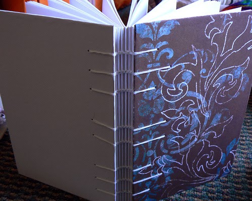
I wanted to look at this book as i feel that the binding is great, however i feel that this could be too much for my own book. The binding on the spine i feel looks really good and holds the book together well. The detailing on the front would be something i'd expect to see on a notebook or something similar however. I would like to know how they have managed to bind the spine in such a way however i feel that it would become so complicated that i would not be able to produce it myself to a high enough standard.

The book above reminds me greatly of the old style home cook boks. They were made for families and aimed mainly at the women of the household asa they were the ones that were most likely to be cooking from it. The colours are something that i have never been fond of. I feel that they make the book look old and dirty rather than giving it a homely feel. For this reason i will avoid using these colours and also the fabric. The issue that i have with using a fabric book is that they are very hard to keep clean after a while. With this in mind they start to look dirty and worn. As i want mine to be something you can just grab off the shelf this would not be ideal as if it were to age quickly then it is more likely to get pushed to the back of the cupboard.
Overall i know that i need to use simple and easy to use material. As i have ruled out using fabric i need to look at what material would be best to use on the book cover as this i need to stay clean and protect the recipes inside. I personally feel that using a thick card would work well as it would protect the recipes inside without becoming aged, it would also keep the book straight. For the binding i want to keep it simple but i also want it to be strong enough to hold it together . I will be using waxed thread to bind as i feel that this will keep the book tight together but will allow the pages to move slightly if they are pulled over quickly.
No comments:
Post a Comment